A good user experience (UX) is essential for customer loyalty. It doesn’t matter what you sell online; paperclips, consultancy or vintage pottery – customers will desert you if you offer poor customer experience. Back in the day, it was OK for you only to have a ‘web presence’. Many corporate websites were often like an online business card. They only contained bland corporate information and contact details. Today, though, your website must have a purpose and be functionally organised to meet your goals. But web users can be fickle. And with so much competition for digital eyeballs, your website needs to be quick to load and easy to navigate. Today, there is plenty of UX data for how users surf the web – what keeps them on the page and what causes them to reach for the back button.If UX has been somewhere on your to do list (but never made it to the top), it’s time for you to make a start. UX optimisation drives results – and a recent announcement from Google means that it’s about to factor more in the ranking of your website.This article looks at the two of the biggest gripes web users have about UX – speed and navigation. Then we’ll finish with how Google intends to measure UX through new metrics it calls ‘Core Web Vitals’.
Optimise Page Load Time.
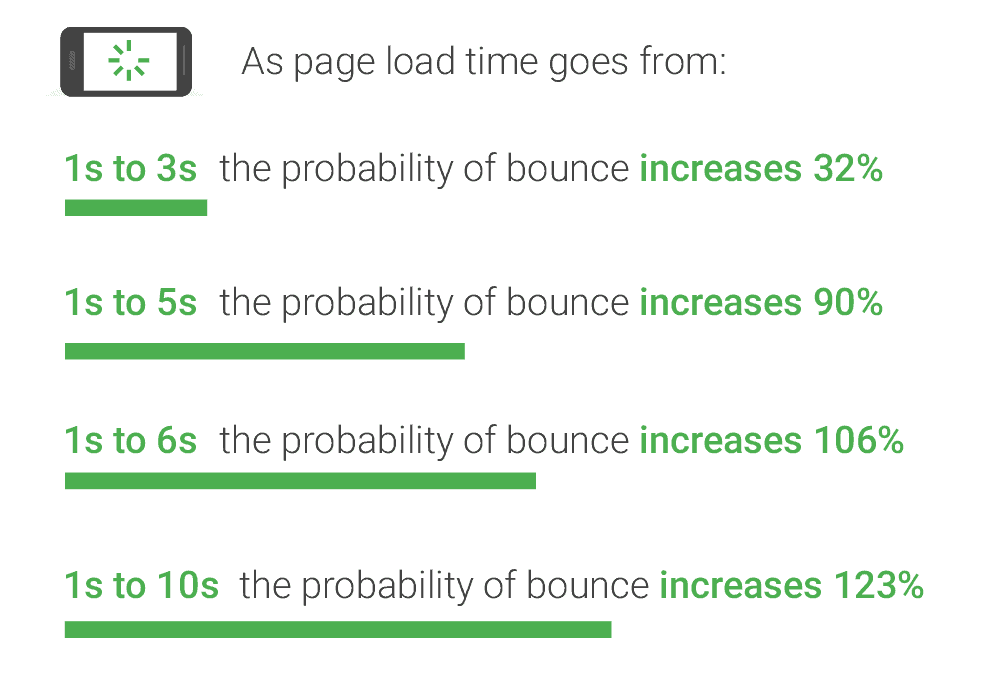
Perhaps the most critical of UX measurements is how fast your website loads. On desktop or mobile, the speed that your page loads affect whether a user decides to stick around.The longer loading takes, the greater chance for a user to ‘bounce’ back to the search results for another option. As you can see from the study below; you have very little time before a user becomes increasingly frustrated and navigates away.

How to Measure Page Loading Speed?
GTMetrix is a popular free tool where you can test out your pages. The results benchmark you against other evaluated pages and offer suggestions for improvement. You can also sign up to monitor your pages over time and get alerts for speed loading issues.

How to improve page loading speed?
Improving your page load speed should be a continuous process. Look for marginal gains from all the individual elements that make up your page. The first elements you might look to optimise are:
Images
Optimising your images can be a quick win for improved page responsiveness. The .png image format is best suited for logo graphics, and the .jpg format is more suitable for higher resolution images.
Resize your images before you add them to your page. You prevent the need for resizing on the fly by CSS code as the page loads.
Caching
It’s unlikely that you will change images like your logo or similar standard graphics on your page frequently. So instruct the visitor’s browser to store a copy locally on the user’s device. On the user’s next visit, the image will not need downloading, speeding up the page load time.
Simplified Layout and Navigation
Another UX principal you need to get right is your layout and navigation. In the early 2000s, thanks to Adobe Flash, there was a trend for companies to produce fantastical websites. Web designers made imaginative animated pages with innovative menu systems.You don’t see them any more because users mostly hated them. They could take a minute or more to load, and once loaded, were hard to navigate. Most have now disappeared from the web, but you can still see videos of them on YouTube.

Make sure the website you create today is designed with the end-user in mind. Use familiar layouts and intuitive menus.
Apple gets it right with simple menus and a focus on its latest product. They know their users and what kind of information they are looking for.
Pleasing Aesthetics.
Your website needs the right look for your visitors. Colour choice, professional images, and font selection all play their part in building customer trust. Also, your site will need to render well on all device types and offer simple, frictionless navigation.
In 2020 the web still has many examples of web design firmly stuck in the 1990s. The example below is from the Yale University School of Art. An organisation, you would think to be at the cutting edge of design practices, instead has a site which looks as though it was created for a school project.

Interstitial (Popup) Usage.
You have likely experienced frustration when surfing the web due to the sheer number of clicks required before you can actually start reading a webpage. GDPR notices, requests to know your location, chatbot menus, and, even worse, ‘we would like to send you notifications’!
Now, GDPR notices are a legal requirement, user expected, and won’t affect your ranking in the search engines. But, other types of interstitials do negatively affect UX, and potentially your rankings so should be used sparingly.If you’re presenting an offer or trying to capture a visitor’s email address on your website via popup or overlay, try not to block content and make them easy to dismiss. Even the biggest and best are not immune to making this mistake. Below is how CNN attempted to capture email addresses, purportedly for a ‘daily briefing’ email.

The frustration this can cause for someone only looking to check out the latest headlines is easy to understand.
Sumo.com, after being previously called out for a full-page interstitial, now uses an unobtrusive pop-down bar at the top of the page. It’s coloured orange to make it stand out, but not in a shade that clashes with the rest of the colour pallet. The bar also has a nice big X to close it and also works well on mobile (i checked!).

Why should you pay attention to UX (User Experience) in 2020 ?
Google’s long-stated mission is to ‘organise the world’s information and make it universally accessible and useful’. Google wants to provide its users with useful, relevant content quickly. They continually strive to become better at what they do through regular updates to their search algorithm.Google has many variables it uses to rank its search query results. While they keep the exact weighting of each variable a secret, for your content to rank well, your website will need to tick several boxes, such as:
- Be Hosted on a secure server
- Have Good, Useful Content
- Be Quick to Load
- Be Linked to From Authoritative Sites
- Be Mobile-Friendly
- No intrusive Interstitials (popups)
How Google Plans to Measure UX?
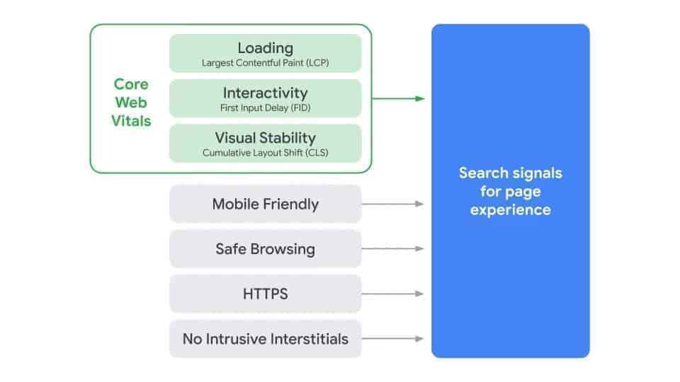
UX sounds like a subjective measurement. How do you measure the human experience of a web page? Well, Google already considers things like mobile-friendliness and interstitial usage as a measure of UX. But, they now think they have found metrics to take it a step further with three new measurements; known as LCP, FID, and CLS.
Google refers to these three metrics as their ‘Core Web Vitals’. Let’s break them down.

LCP – Largest Contentful Paint.
The LCP measurement is a speed measurement, but its more than how fast a page loads. Google knows that we are all in a rush and want to start using a webpage as soon as we possibly can. So, the LCP metric measures how fast the largest content element takes to load.
If the page loaded contains an article, then good UX practice would be to ensure text loads first so that the user can start to read.
Of course, Google doesn’t know for sure what has first loads is the element a user is looking for. But, the LCP metric is the determination that the pages main content has likely loaded. Aim to load your central element in less than 2.5 seconds.
FID – First Input Delay.
FID is the measurement of how quickly the browser responds to the first input from the user (like clicking a link). If you load your page elements in an order favourable to the user, they may start to interact with the page before everything else has loaded.
But, if the browser is still loading a substantial page element (like one based on Javascript), then the browser has to finish loading it before it can respond to the user’s first input. This can cause an annoying delay for the user, which Google considers poor UX.
So much so, that Google says you should aim for an FID response time of less than 100ms! So the need for your entire page to load as fast as possible has never been greater.
CLS – Cumulative Layout Shift.
You have probably experienced a page jumping around when you go to click a link, which frustratingly means you click something else instead.
Google feels your pain, and the CLS metric is set to deal with this. It measures the amount of unexpected layout movement a user experiences. A slow loading element interfering with already loaded ones is often the culprit. Or an unscrupulous trick by webmasters to generate ad clicks.
Google is setting a high bar for this metric too. If visible elements move around after 0.1 seconds, then Google would like to see an improvement. You have probably experienced a page jumping around when you go to click a link, which frustratingly means you click something else instead. Google feels your pain, and the CLS metric is set to deal with this. It measures the amount of unexpected layout movement a user experiences. A slow loading element interfering with already loaded ones is often the culprit. Or an unscrupulous trick by webmasters to generate ad clicks.Google is setting a high bar for this metric too. If visible elements move around after 0.1 seconds, then Google would like to see an improvement.
Why is Google introducing Core Web Vitals?
Google says that ‘ a bad page experience could stand in the way of a person being able to find valuable information on a page’. Keeping in line with its mission statement on information accessibility.

These new ‘Core Web Vitals‘ aim to measure how satisfying it is to browse and interact with your webpage. You can find further information, and tools to see how your website currently stacks up on the Google Chrome Blog
Conclusion
In competitive spaces, UX is vital for customer loyalty. And providing a positive UX will play an increasingly significant part of your websites ranking factor.
Google has announced the algorithm update with an unusually long notice period. It could be that the COVID-19 pandemic has delayed its release, or signifies the importance that Google will place on the metrics. We will see.


